Custom progress bar in Power Pages
Jan 3, 2024 • 4 • 806
Table of contents
A progress bar visually communicates the completion status of a process. In a Model Driven App there is the Business Process Flow, in Power Pages there is no default component to visualize this. It is crucial for the progress bar to be flexibility and use the data stored in Dataverse and ensuring readiness for the addition of any extra status in the process without constraints.
Challenge accepted 💪!
Scenario
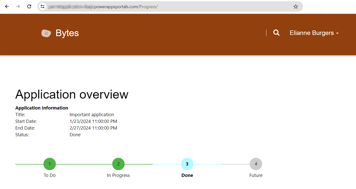
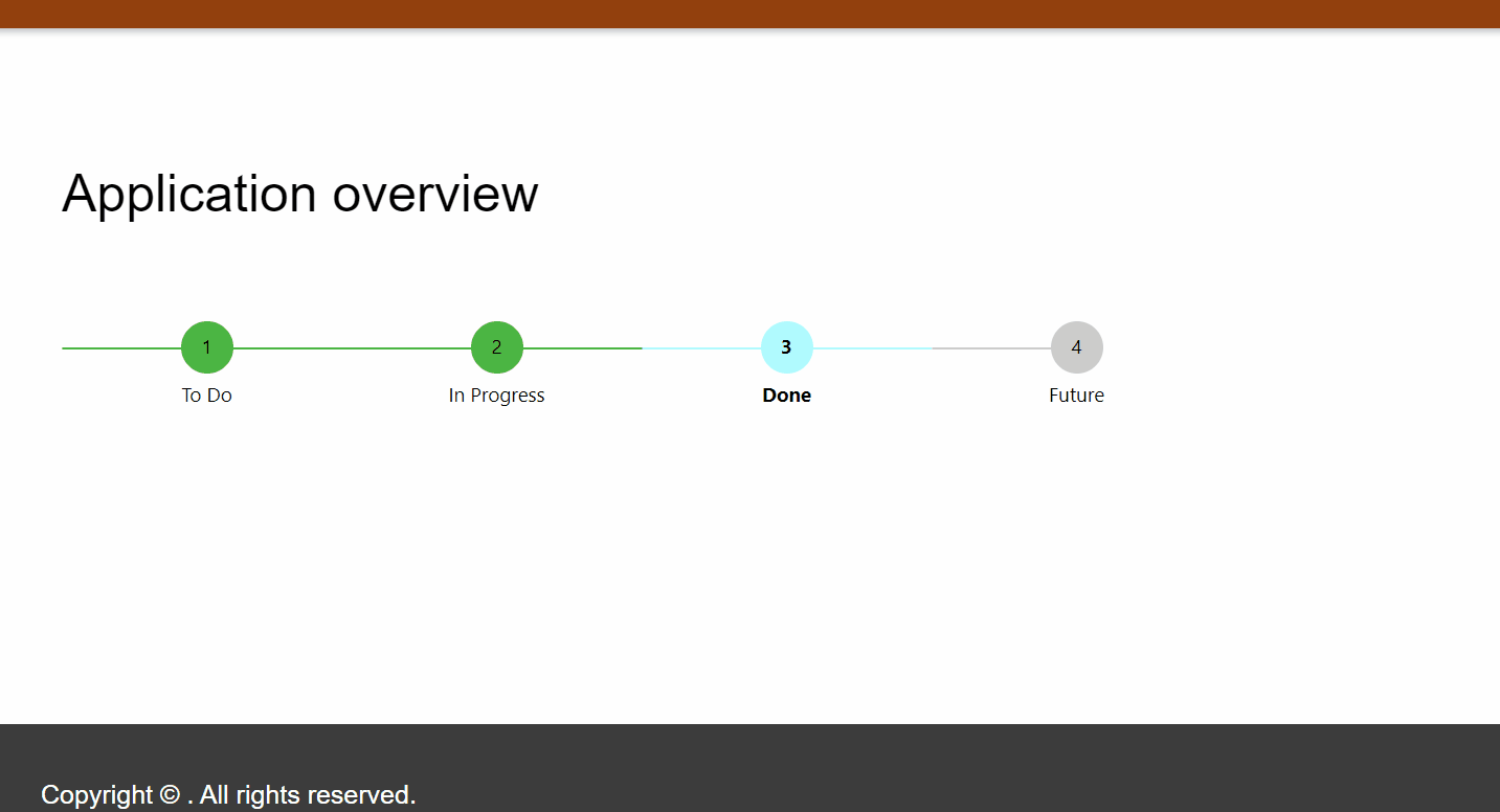
In this scenario, an application Power Pages site is designed for individual contacts, where each contact can have only one associated application. The final output is a webpage displaying comprehensive details of the specific application, including a visual progress bar that indicates the various stages of the application process.
Datamodel
In order to facilitate a highly adaptable status configuration, the potential statuses are stored in a separate table. The data model used in this scenario:
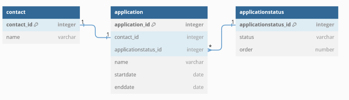
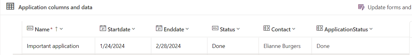
The application table contains information about the application including the status.
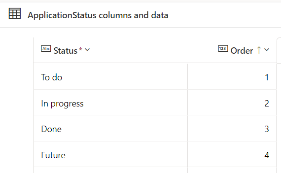
The application status table contains all the possible status values:
Content snippet
To accomplish this, start by creating an HTML content snippet. This snippet will serve as the foundation for displaying the application details and the associated progress bar.
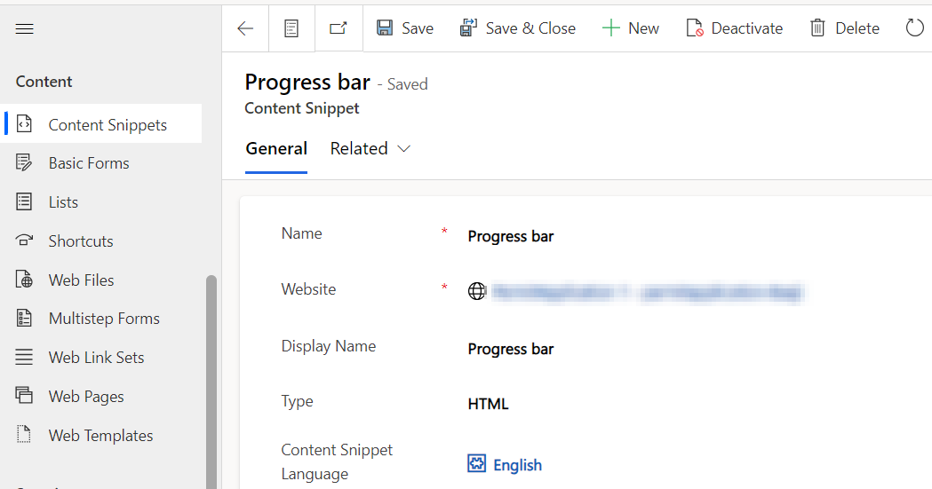
In this scenario the name of the snippet is: Progress bar.
Add content snippet to the page
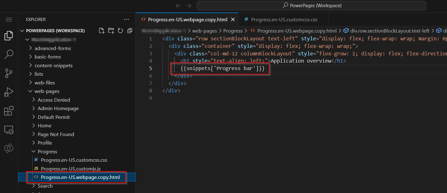
Open the page on which you want to display the progress bar and choose for Edit code. In this example the name of the page is ‘Progress’.
Add {{snippets['Progress bar']}} to the page.
Liquid code
To retrieve the application details for the logged-in user, a FetchXml query is essential. This query filters the application table based on records associated with the logged-in user. While in this scenario, only one record is expected, theoretically, there could be multiple records.
To handle this, a for loop is introduced to set variables for the details of each record. These variables can then be utilized within the table structure to display the application details.
Alongside the details of the application, the order value associated with the linked entity “ApplicationStatus” is also retrieved.
<!--Get application details from logged in user -->
{% fetchxml query %}
<fetch version="1.0" mapping="logical">
    <entity name="cr4c5_application">
    <attribute name="cr4c5_name"/>
    <attribute name="cr4c5_enddate"/>
    <attribute name="cr4c5_startdate"/>
    <attribute name="cr4c5_applicationstatus"/>
    <filter>
        <condition attribute="cr4c5_contact" operator="eq" value="{{user.id}}" />
    </filter>

    <link-entity name="cr4c5_applicationstatus" from="cr4c5_applicationstatusid" to="cr4c5_applicationstatus" link-type="outer" alias="aliasstatus">
      <attribute name="cr4c5_status" />
      <attribute name="cr4c5_order" />
    </link-entity>

</entity>
</fetch>
{% endfetchxml %}

{% for result in query.results.entities %}

    {% assign name = result.cr4c5_name %}
    {% assign startdate = result.cr4c5_startdate %}
    {% assign enddate = result.cr4c5_enddate %}
    {% assign currentStatus = result['aliasstatus.cr4c5_status'] %}
    {% assign currentStatusOrderValue = result['aliasstatus.cr4c5_order'] %}

{% endfor %}


<table style="width:30%;">
  <tr><th>Application Information</th><th></th></tr>
  <tr><td>Title:</td><td>{{ name }}</td></tr>
  <tr><td>Start Date:</td><td>{{ startdate }}</td></tr>
  <tr><td>End Date:</td><td>{{ enddate }}</td></tr>
  <tr><td>Status:</td><td>{{ currentStatus }}</td></tr>

</table>
<br/><br/><br/>
Determine value of current status
The last part of the code makes it able to show the progress bar.
The code starts with retrieving all the possible application statuses and setting the highest order value. This highest order value is crucial for identifying the overall completion of the process, ensuring that the entire progress is marked as completed.
Different status color
The progress bar should have the capability to showcase distinct steps in varying colors, distinguishing between completed, active, and future stages.
<!-- Get all application statuses -->
{% fetchxml queryapplicationorder %}
<fetch version="1.0" mapping="logical">
    <entity name="cr4c5_applicationstatus">
    <attribute name="cr4c5_status"/>
    <attribute name="cr4c5_order"/>
    <order attribute="cr4c5_order" descending="false" />
</entity>
</fetch>
{% endfetchxml %}


<!-- Get highest status order -->
{% assign maxVal = queryapplicationorder.results.entities[0].cr4c5_order %}

{% for val in queryapplicationorder.results.entities %}
  {% if val.cr4c5_order > maxVal %}
    {% assign maxVal = val.cr4c5_order %}
  {% endif %}
{% endfor %}


<div class="stepper-wrapper">
 {% for applicationorder in queryapplicationorder.results.entities %}
      <div class="{% if applicationorder.cr4c5_order < currentStatusOrderValue or currentStatusOrderValue == maxVal  %} stepper-item completed {% elseif applicationorder.cr4c5_order == currentStatusOrderValue %} stepper-item active {% else %} stepper-item {% endif %}">
        <div class="step-counter">{{ applicationorder.cr4c5_order }}</div>
        <div class="step-name">{{ applicationorder.cr4c5_status }}</div>
      </div>
{% endfor %}
</div>
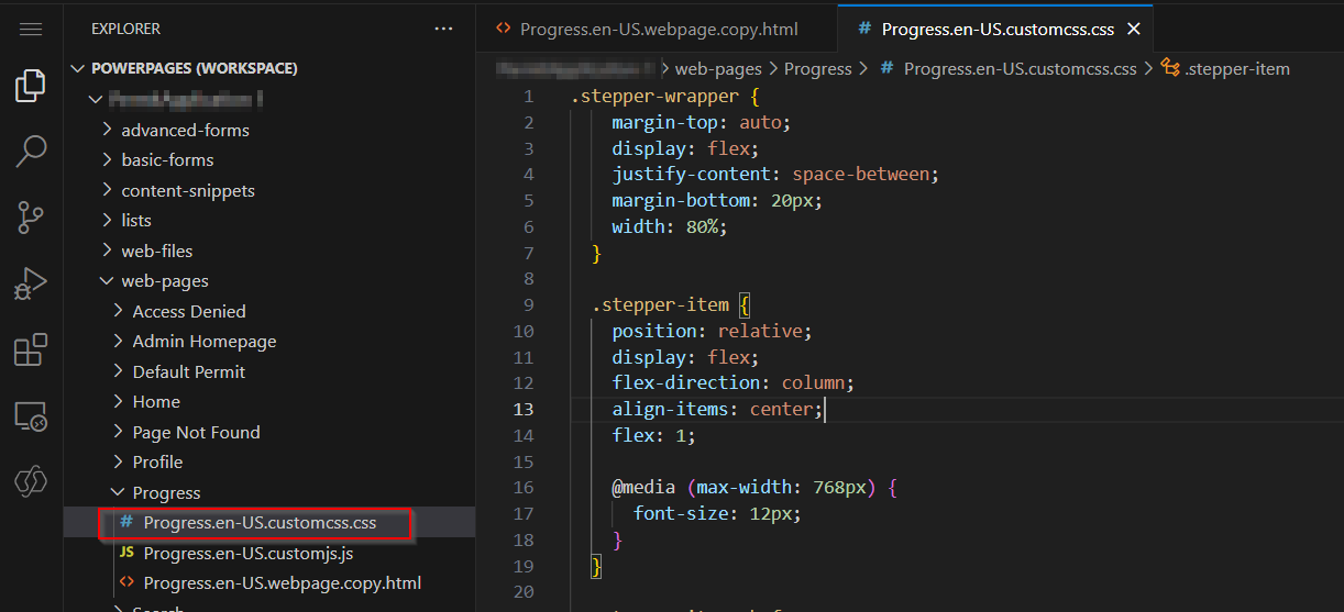
Custom CSS
The CSS of the classes is added as custom CSS to the page. CSS is inspired by DEV Recipes .
.stepper-wrapper {
    margin-top: auto;
    display: flex;
    justify-content: space-between;
    margin-bottom: 20px;
    width: 80%;
  }

  .stepper-item {
    position: relative;
    display: flex;
    flex-direction: column;
    align-items: center;
    flex: 1;

    @media (max-width: 768px) {
      font-size: 12px;
    }
  }

  .stepper-item::before,
  .stepper-item::after {
    position: absolute;
    content: "";
    border-bottom: 2px solid #ccc;
    width: 100%;
    top: 20px;
    transform: translateX(-50%);
    z-index: 2;
  }

  .stepper-item::after {
    left: 50%;
  }

  .stepper-item .step-counter {
    position: relative;
    z-index: 5;
    display: flex;
    justify-content: center;
    align-items: center;
    width: 40px;
    height: 40px;
    border-radius: 50%;
    background: #ccc;
    margin-bottom: 6px;
  }

  .stepper-item.active {
    font-weight: bold;
  }

  .stepper-item.completed .step-counter,
  .stepper-item.active .step-counter {
    background-color: #4bb543;
  }

  .stepper-item.completed::after,
  .stepper-item.active::after {
    border-bottom-color: #4bb543;
    z-index: 3;
  }

  .stepper-item.active .step-counter {
    background-color: #b0fbff;
  }

  .stepper-item.active::after {
    border-bottom-color: #b0fbff;
  }

  .stepper-item:first-child::before,
  .stepper-item:last-child::after {
    content: none;
  }
Responsive
The CSS is configured to facilitate responsiveness design.
Tips
- Use FetchXml Test in the XrmToolBox to test your FetchXml queries.