
What Mario Kart teaches us about user experience
Aug 8, 2025 • 3 • 432
Table of contents
Picture this: you open a Power App. It works? Sure. But you’re not sure where to click, the colors are clashing, and you feel… a bit lost. Sound familiar? This is exactly why UX in low-code apps is not just a “nice to have,” but crucial for adoption.
🎮 Mario Kart as a UX teacher
Take Mario Kart. Yes, that cheerful racing game. Without realizing it, it teaches you a UX lesson: visuals guide behavior.
After a race, you see arrows and colors indicating the ranking.

The place in the rankings is preceded by an icon:
- ▲Orange arrow up: if the contestant moved up one place
- — Green line – if the contestant stayed at the same position
- ▼ Blue arrow down – if the contestant dropped
What happens in your brain? It stutters. You need to look twice. The UX signals don’t add up.
If you ask me, I would use:
▲Green arrow up
— Orange line
▼ Red arrow down
Now translate that to Power Apps: if icons, colors, or flows aren’t intuitive, users disengage. Even if the app is technically flawless.
Real-world ‘before & after’ examples
Before
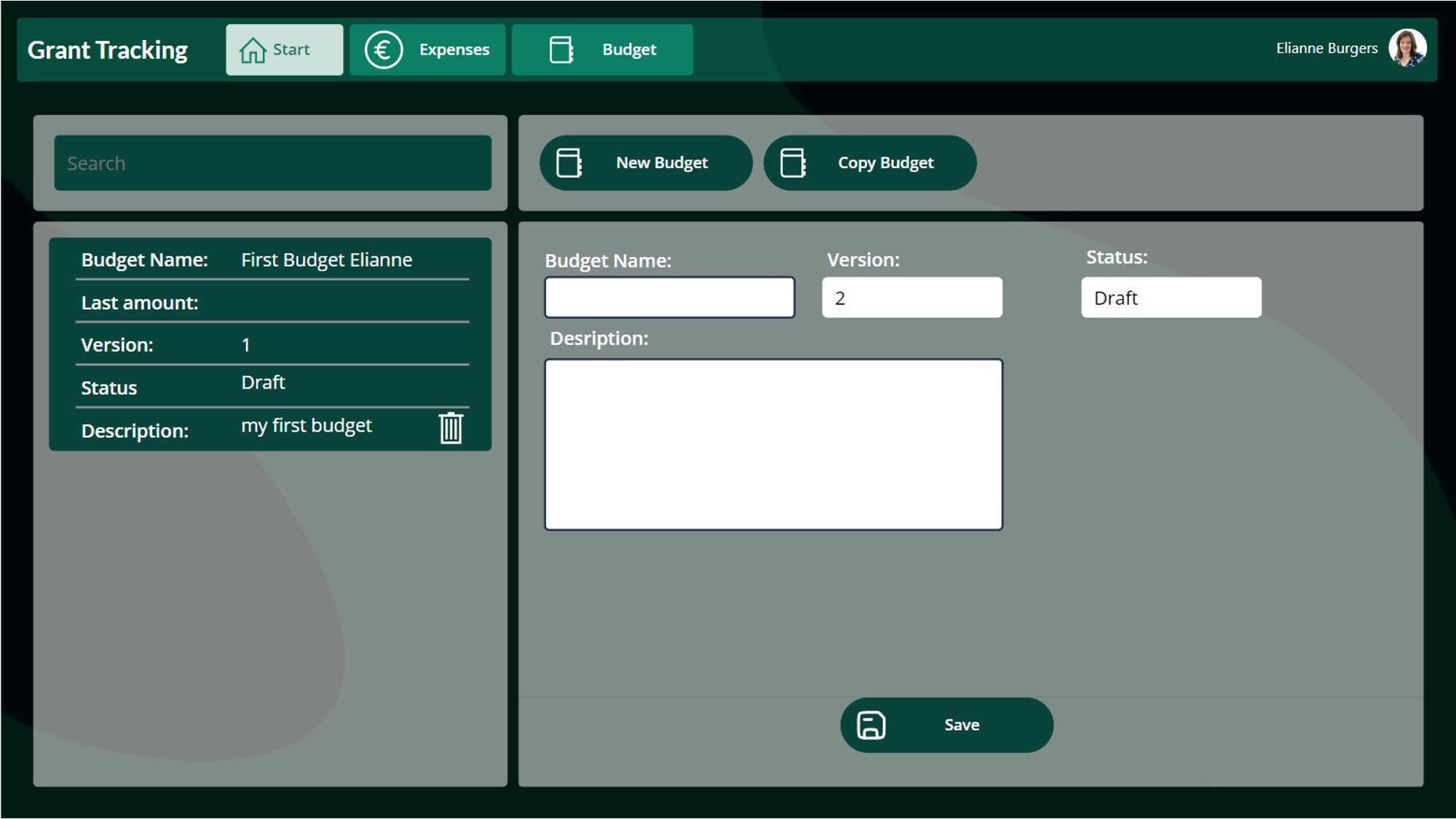
After
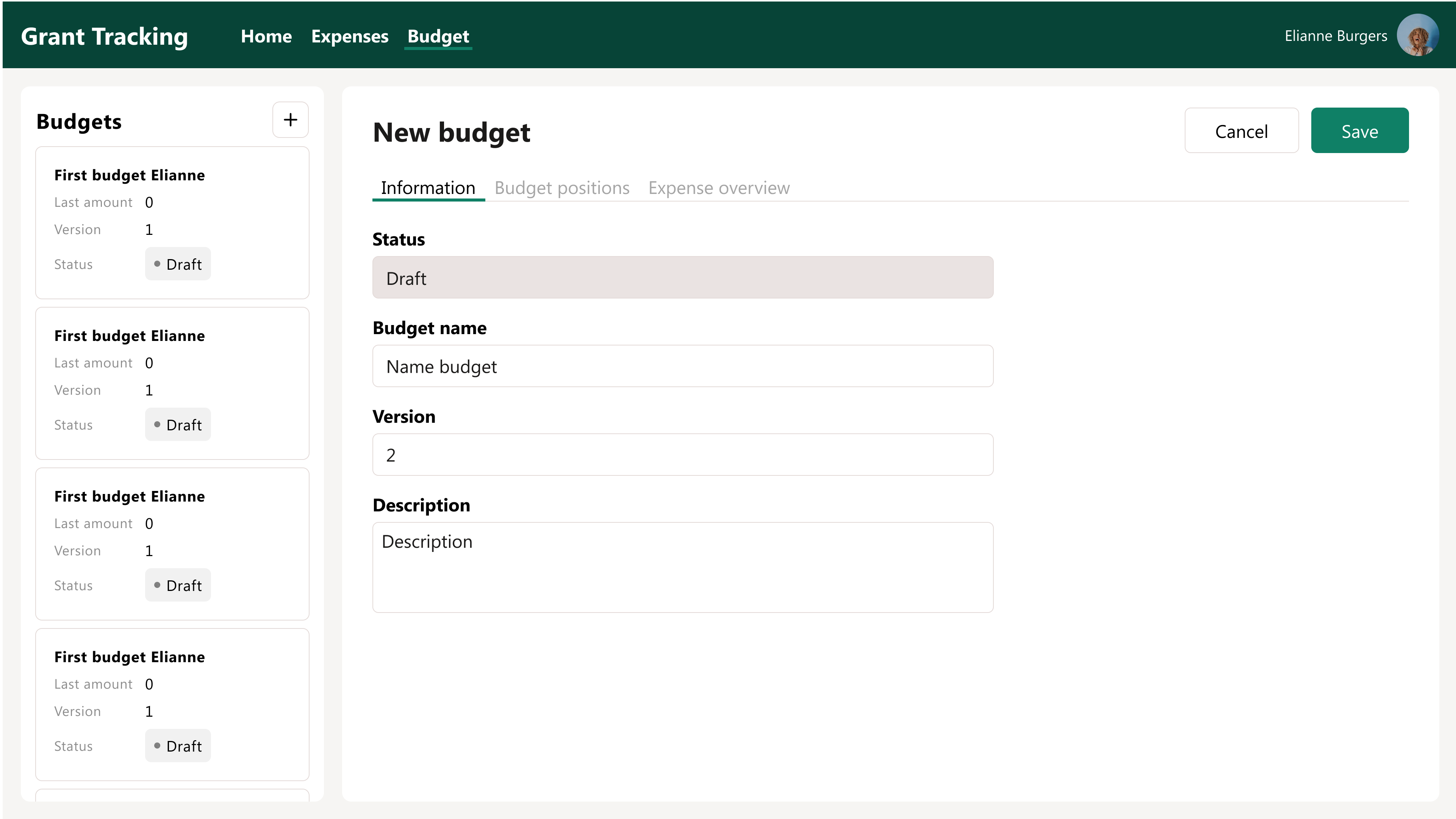
Before
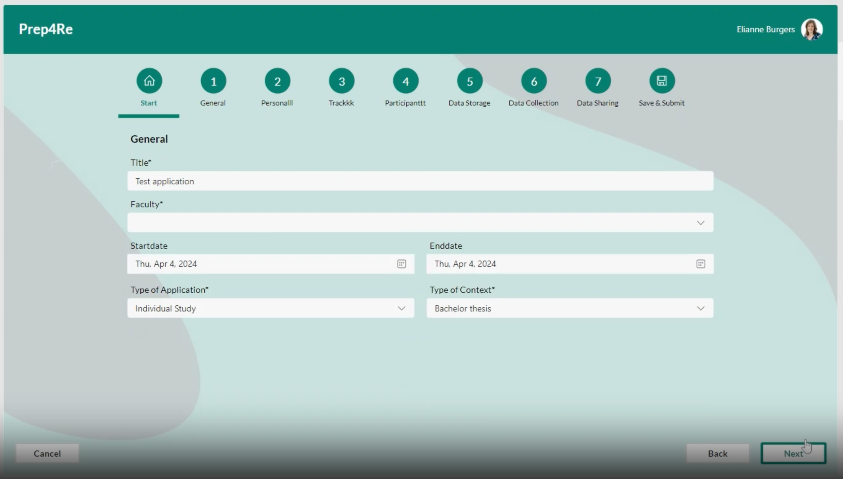
After
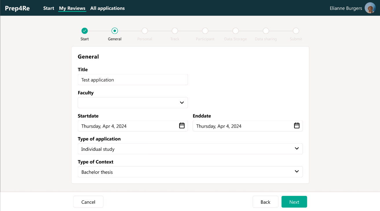
During redesigning topics like consistency, navigation, accessibility and usability were discussed. The redesign itself is done by my colleagues at Blis Digital.
Before:
- The menu was styled like an action button
- Colors used: white text on a dark background
- Identical icons were used for different actions
After:
- Clear and logical user flows
- An intuitive and consistent color palette
- The active menu item is clearly highlighted
Following the redesign, users were able to navigate effortlessly, and the improved look-and-feel delivered a much smoother overall experience.
🎨 Why UX goes beyond branding
The biggest trap? Wrapping everything in corporate colors and calling it a day.
UX goes further: it’s about recognition, predictability, and subtle signals that users instantly understand.
Think of an airport where you can find the restroom without reading a word, thanks to the pictograms.
Quick tips to improve UX today
- Test with real users: not just IT. Watch them click, see where they get stuck.
- Use universal signals: green for success, red for error, a clear icon set.
- Create visual rhythm: give users calm through structure and consistency.
- Dare to deviate: if corporate orange doesn’t feel like “success,” pick what works.
Final thoughts
Mario shows us: even a game can confuse your brain when signals don’t align. The same goes for Power Apps.
By taking UX seriously, you create the difference between an app people “have to” use and one they’re happy to use.